Color Palette and Design Elements
In addition to our logo, color is the next best way to make sure our materials reflect the Island University.
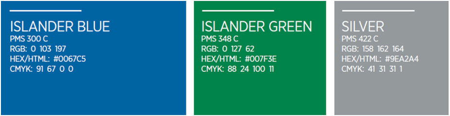
Primary Palette
Islander Blue and Islander Green are our primary university colors, with silver serving as an accent. Islander Blue is the dominant color for design purposes.
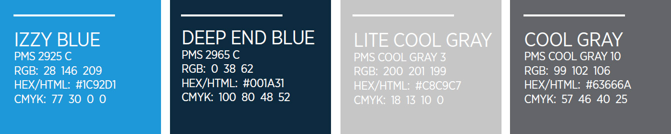
Secondary Palette
Secondary colors are used in smaller proportion and should never overwhelm the primary colors.
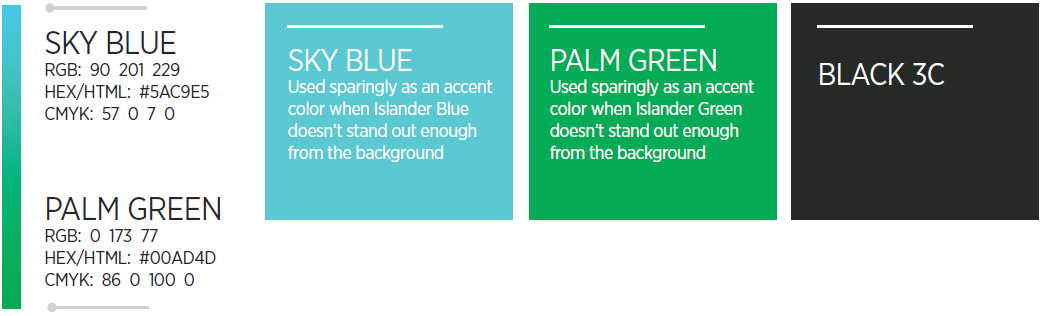
Special Use Accent Colors
While not official colors within the primary or secondary palettes, Sky Blue, Palm Green, black, and the gradient serve as important design elements in creating the university brand.
For usage guidelines, please refer to the Design Elements and Sample Work sections.
Design Elements (The TAMU-CC Gradient)
The university gradient functions as a critical design support element.
It can be used as a vertical or horizontal line accompanying headlines, as element backgrounds, or as borders to “pop” secondary photography.
When used vertically: blue at top/green at bottom
When used horizontally: blue at left/green at right
The gradient must be used in its entirety — from blue to green.
Sample call to action element

Incorrect gradient use
Never use only a portion of the gradient (i.e., light green to darker green).