Links
Add meaningful descriptions so students know where a link will take them.
Impact
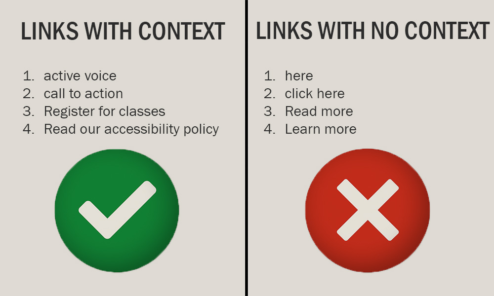
Imagine you are reading your favorite book and want to revisit a specific chapter. You would probably use the table of contents, right? It tells you exactly where to go. Now imagine if that table of contents just said, "Read more", "Click here", or "here" for every chapter. You would have no idea where you were going!
Did you know? When you visually scan a page, you are looking for indicators that help you identify links. These are typically marked by underlined text. Some links look like buttons or menus in the header or footer of a page.
Screen reader users can do something similar using a built-in link navigation feature, but it is only helpful if the context is included in the link text. The goal is similar to visually scanning the page. The screen reader user does not want to read the full page, including all the links. This can be annoying if they have read the links before and just want to find something specific on the page.
If the link just says "here" or shows a long, messy web address, it does not help them at all. In fact, screen readers might read out each letter of the web address, which is slow, confusing, and does not give any real clue about the destination.
Instead, links should be like chapter titles. They should be clear and specific, so everyone knows exactly where they are going with just a glance or a quick listen.
How to
To make your links more useful for everyone, avoid vague phrases like "click here" or "read more." Instead, write link text that clearly says what the link is for.
Best practices
Frequently asked questions
Additional guidance
You can learn more about providing proper links and other text with the following accessibility guides: