Headings
Use clear headings to help students navigate your content quickly.
Impact
Headings are like signposts on a road. They help everyone understand where they are and where they are going. When used correctly, headings break up content into clear sections, making it easier to read, scan, and navigate.
For students using screen readers, headings are essential. Screen readers can pull up a list of all the headings on a page, allowing students to jump straight to the section they need, just like using a table of contents. Without headings, they would have to listen to the entire page from the top all the way to the bottom, which can be time-consuming and frustrating.
Did you know? When you visually scan a page, you are looking for indicators that help you identify different sections. These are typically marked by headings, which may vary in color, size, font, or other stylistic features. This visual structure allows you to navigate or skip around the page more easily.
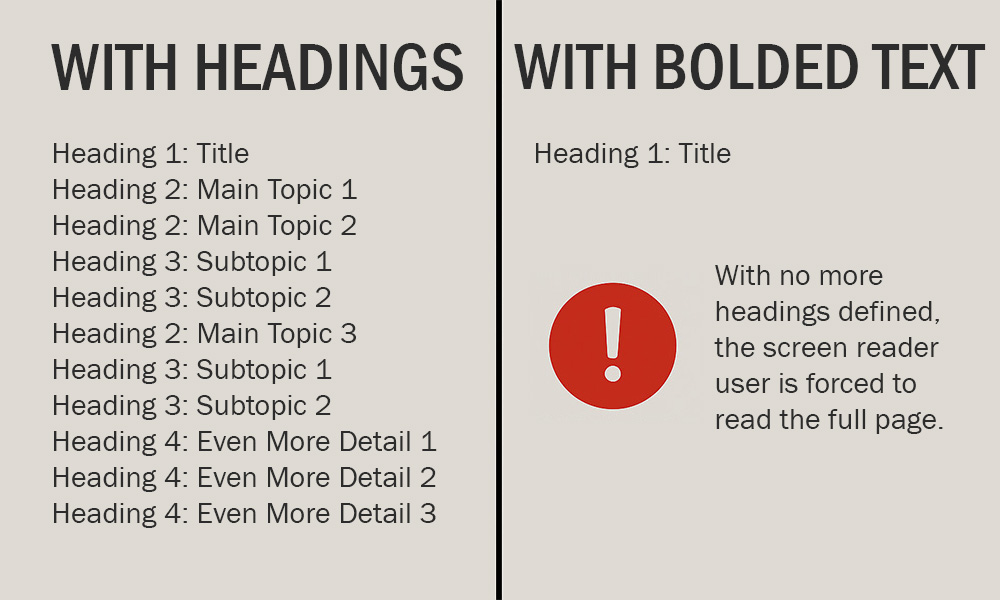
Screen reader users can do something similar using a built-in heading navigation feature, but only if the headings are semantically defined. If you simply bold or italicize text, it remains a paragraph and will not be recognized as a heading by assistive technologies.
Even for students who do not use assistive technology, headings improve the experience. Think about students reviewing course materials. They can quickly find what they need without being forced to read everything on a page.
Using headings is not just about visual style. It is about structure, clarity, and inclusion. Accessible headings help students engage with your content more efficiently and equitably.
How to
Think of headings like a phone menu. You know how you press 1 for English, then 2 for billing, and so on? Each choice leads you to more specific options. Headings work the same way. They help organize your content, so people (and screen readers) can easily find what they need visually and programmatically.
Heading 1: The Page Title
This is the big title at the top of your Canvas page. You do not have to set this one. It is already built in. Just make sure it is clear and unique, so students do not get lost or go into the wrong section.
Heading 2: Main Topics
This is where your outline really starts. Use Heading 2 for the main sections of your content. You will find it in the Text Style dropdown in the Rich Content Editor. Only use it for actual section titles. Do not use them just to make text look bigger.
Heading 3: Subtopics
If your content has smaller sections under a main topic, use Heading 3. Not every page needs this, but it is great for breaking things down further. Again, only use it for subtopic titles. Not for styling regular text.
Heading 4 and Beyond
Some pages might need even more levels, like Heading 4. Just make sure you follow the order. Do not skip around just to change how the text looks. That can confuse screen readers and make your page harder to navigate.
Here is a quick example of how heading levels should flow:
- Heading 1: Title
- Heading 2: Main Topic 1
- Heading 2: Main Topic 2
- Heading 3: Subtopic 1
- Heading 3: Subtopic 2
- Heading 2: Main Topic 3
- Heading 3: Subtopic 1
- Heading 3: Subtopic 2
- Heading 4: Even More Detail 1
- Heading 4: Even More Detail 2
- Heading 4: Even More Detail 3
Best practices
Frequently asked questions
Additional guidance
You can learn more about providing proper headings and other text with the following accessibility guides: