Color contrast

Make sure your text is easy to read for everyone.

Impact

Color is a powerful design tool. It can:

  • Draw attention
  • Set a tone or mood
  • Emphasize key information

However, when used without consideration for accessibility, color can unintentionally exclude people. For example:

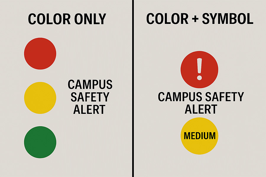
  • Someone with red-green color blindness may not distinguish red from black.
  • A person with light sensitivity may struggle with bright color combinations.
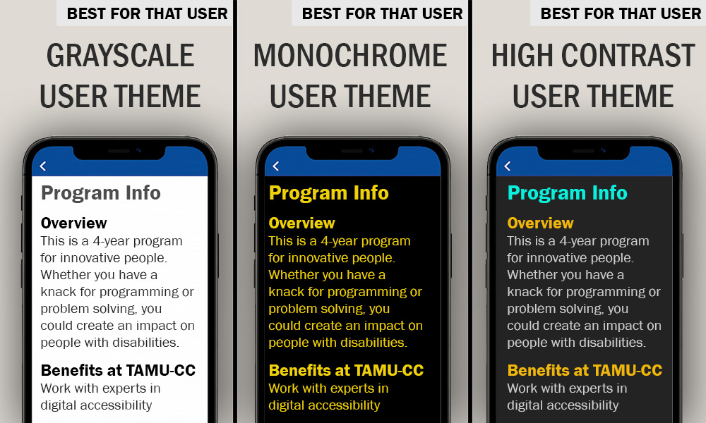
  • A student using a high-contrast theme may not see your chosen colors at all.
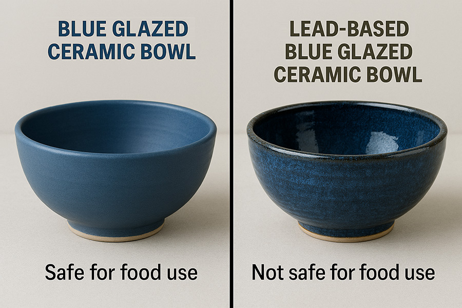
Brand example

At Texas A&M University–Corpus Christi, we use two brilliant brand colorsIslander Blue and Islander Green. These colors are visually appealing, but when used together (e.g., blue text on a green background) they may appear nearly identical to someone with color blindness or using a color filter. In those cases, the text may completely vanish from view.

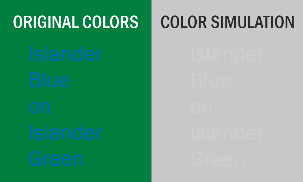
Try this test: Turn on grayscale mode or color filter in your device's accessibility settings. If the text blends into the background, it is not accessible.

How to

"Black and white"

Color contrast plays a vital role in making your content readable. However, choosing the right contrast is not always as simple as using black and white.

While black text on a white background (or white text on black) provides the highest contrast, it can also cause discomfort for some users. People with light sensitivity or certain cognitive disabilities may find this combination harsh or difficult to focus on.

A more comfortable alternative is light gray text on a dark gray background—or the reverse. This pairing still offers strong contrast but is gentler on the eyes, making it easier for many people to read.

Color contrast

If you would like to use color to enhance your content, it is best to do so with care. Color should be used in moderation. Too many colors can distract your audience and make your message harder to follow.

It is also important to consider color blindness. For example, individuals with red-green color deficiency may not be able to distinguish red from black. This means that if you rely on color alone to convey meaning, some users may miss important information.

You can test your color combinations with different tools:

  • Grayscale mode: Available in most device accessibility settings, this mode removes color so you can see how your content appears without it.
  • Color blindness simulators: These tools show how your content looks to people with different types of color vision deficiencies.
  • Color contrast checkers: These tools measure the contrast ratio between text and background colors to ensure they meet accessibility standards.

One recommended tool is the TPGi: Colour Contrast Analyser (CCA). It calculates the contrast ratio and allows you to adjust your colors until they meet the required guidelines. This makes it easier to create content that is both attractive and accessible.

User-centered design

There is no single color combination that works for everyone. People experience color differently. Some need high contrast to read clearly, while others prefer softer tones to avoid eye strain.

Instead of choosing fixed colors, consider using your platform’s default styles or themes. If your system allows custom themes, that is even better. This approach lets users apply their own preferences (e.g., dark mode, high contrast setting) while keeping your content readable and visually consistent.

This is a simple and effective way to make your design work for everyone.

Use of color

Some users rely on color filters or custom display settings to reduce eye strain or accommodate visual impairments. This means:

  • They may not see the colors you selected.
  • They could miss important information if it is only communicated through color.

For example, if you write, "All required questions are in red," someone using a color filter may not be able to identify which questions are required. A better approach is to include a label such as "(Required)" or use an asterisk (*) with a clear explanation.

By combining color with text labels or symbols, you ensure that your message is clear to everyone, regardless of how they view your content.

Best practices

  1. Use color in moderation.
    Too many colors can be overwhelming.
  2. Avoid switching colors too often.
    It can be distracting and confusing.
  3. Let your design breathe.
    Where possible, use white space (or any plain color background) to give your content room to stand out.
  4. Make sure colors contrast well.
    Light gray text on a dark gray background (or vice versa) is usually easier to read.
  5. Avoid tricky color combos.
    For example:
    • Red and black
    • Blue and green (especially Texas A&M–Corpus Christi's shades)
    • Bright or complementary colors that clash (e.g., red and green)
  6. Do not rely on bold text alone.
    If colors do not contrast well, add outlines or shadows to help the text pop.
  7. Be careful with patterns.
    If you are placing text over an image or pattern:
    • Try increasing the font size or thickness.
    • If it is still hard to read, use a solid background behind the text or fade the image into a solid background color.

Additional guidance

You can learn more about using good color contrast with the following accessibility guides: